1 - General
2 - Upload files
2. Upload files
The following steps explain how the uploading of files (photographs, videos, documents) works in general.
Media overview

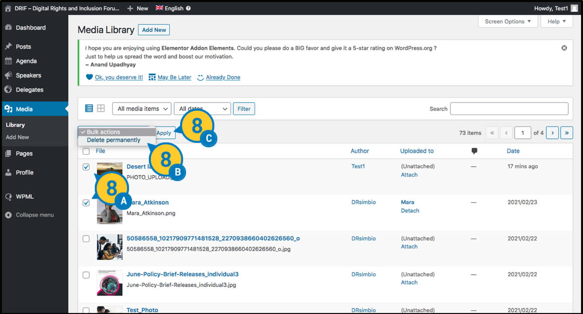
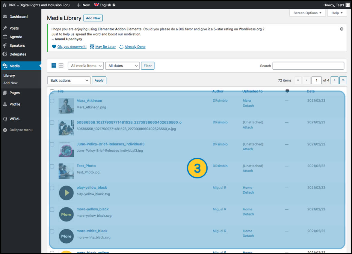
 In the main menu, locate and click on “Media”. In the main menu, locate and click on “Media”. |
 This window shows all the files uploaded to the website in preview mode. This window shows all the files uploaded to the website in preview mode. |
 If we prefer a list view. Click on this button. This view provides us with more information about the file, but it is less visual when searching for a photo. If we prefer a list view. Click on this button. This view provides us with more information about the file, but it is less visual when searching for a photo. |
Upload files
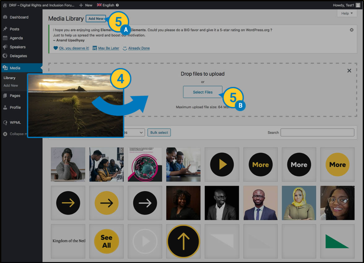
 The easiest way to upload files to our web space is simply by dragging the items to be uploaded from our desktop onto this screen. And the upload will start (See Step 6). The easiest way to upload files to our web space is simply by dragging the items to be uploaded from our desktop onto this screen. And the upload will start (See Step 6). |
 Alternatively we can click the “Add new” button and then click the “Select File” button to browse our local folder system and upload the desired photos. Alternatively we can click the “Add new” button and then click the “Select File” button to browse our local folder system and upload the desired photos. |
 Note: File size is limited to 64M, uploading larger files is not recommended. They must be pre-optimised to be served by the website. Note: File size is limited to 64M, uploading larger files is not recommended. They must be pre-optimised to be served by the website. |
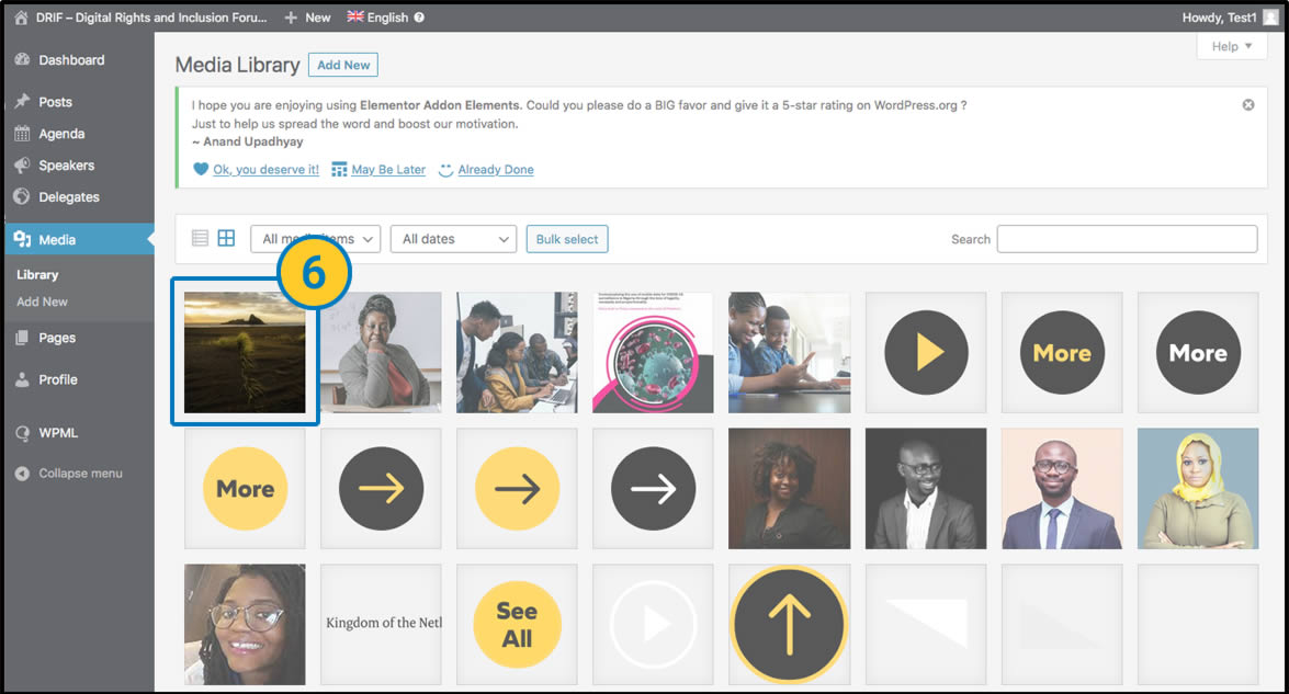
 Upload file to appear in the media list. If it does not appear, or appears to be Depending on the browser, or the server where it is hosted, it is possible that this upload may appear to have failed. Reload your browser to see if your file has uploaded correctly. Upload file to appear in the media list. If it does not appear, or appears to be Depending on the browser, or the server where it is hosted, it is possible that this upload may appear to have failed. Reload your browser to see if your file has uploaded correctly. |
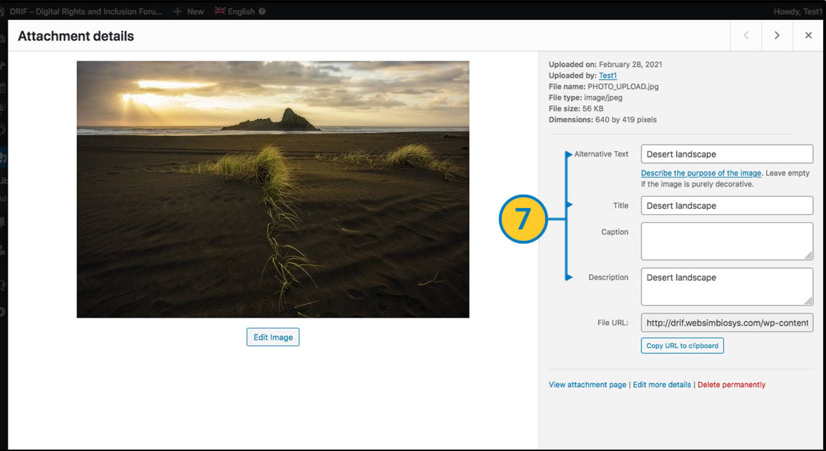
 You must take into account when uploading a file the style and accessibility recommendations, adding correctly at least the fields “Alternative text” “Title” and “Description”. To do so, once the file has been uploaded, click on it to see the details. You must take into account when uploading a file the style and accessibility recommendations, adding correctly at least the fields “Alternative text” “Title” and “Description”. To do so, once the file has been uploaded, click on it to see the details. |
Delete files
 If you wish to delete a file or photograph, simply in the list view (see step 3) tick the boxes of the files to be deleted, select the option “Delete Permanently” from the drop-down menu and click on the Apply button. If you wish to delete a file or photograph, simply in the list view (see step 3) tick the boxes of the files to be deleted, select the option “Delete Permanently” from the drop-down menu and click on the Apply button. |
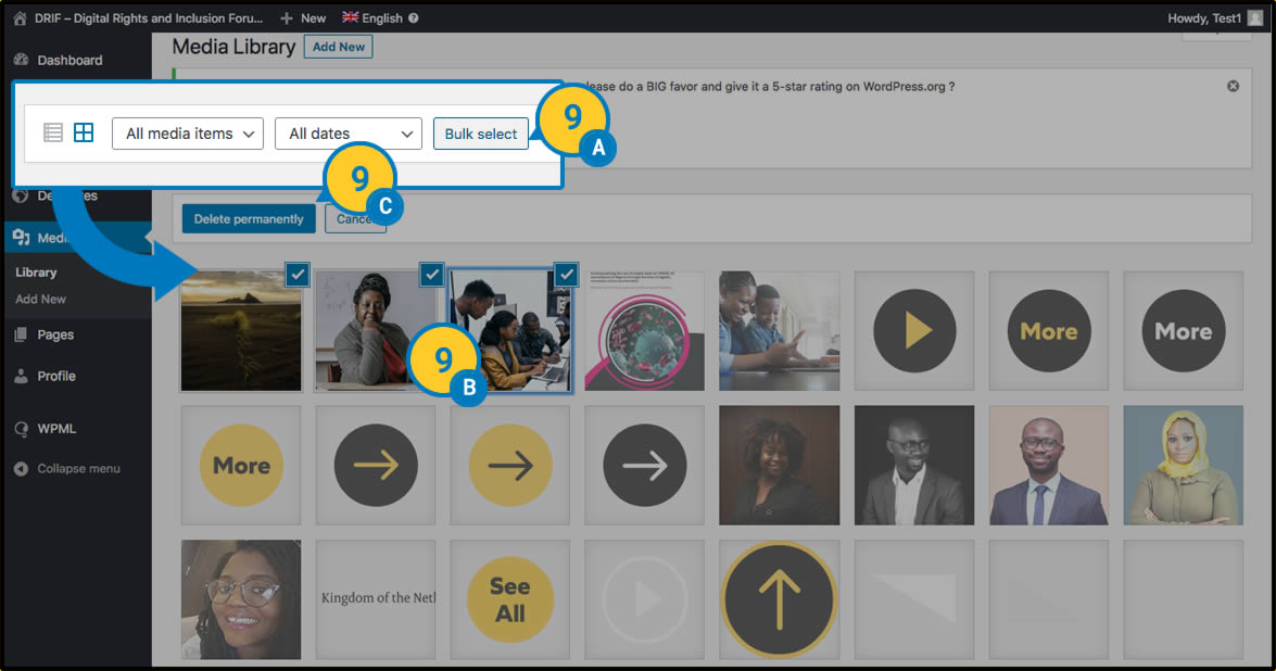
 In the Grid view, click on the “Bulk Select” button and select the files to be deleted. Confirm the deletion by pressing the “Delete Permanently” button.
 |
|
Note: Make sure that the deleted element is not being used anywhere on the website or link. If it is, an empty space, a missing element or a 404 error page will appear wherever it is. Deletions cannot be undone and re-uploading a file does not fix the problem. |
In general, files (photographs, videos, documents) can be uploaded when updating specific content, from the page where the file is located or the link button, by clicking on the element to be modified and following the above steps, without requiring a previous or independent upload.
3 - Home
3. Home
In the next chapters of the manual we will deal with specific changes to the pages that complete the website. We will leave for later (Chapter 10) the modification of elements common to the whole website, such as the “header menu” or the “footer”.
Section One – Introduction
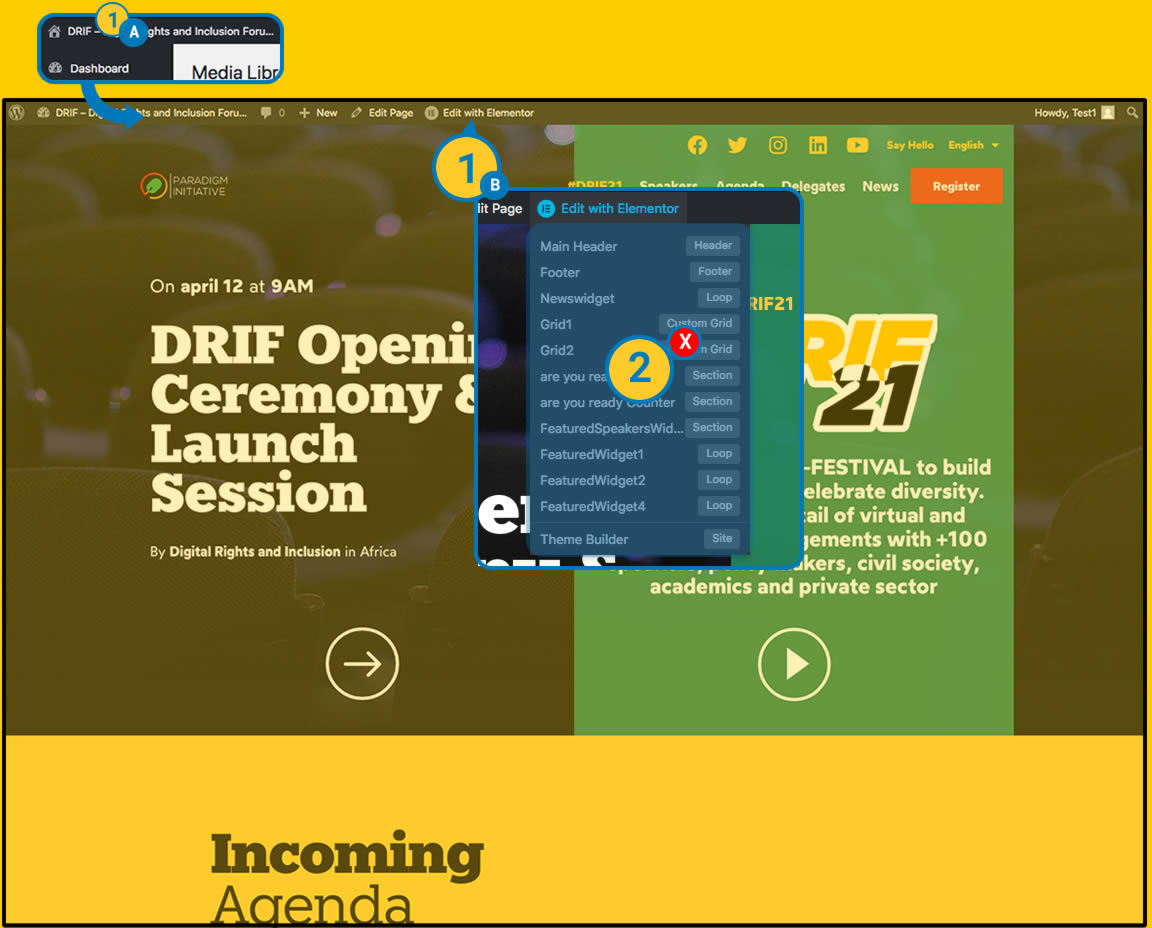
| (A) We are located on the “Home” page in the “frontend” view of the website as we saw earlier (View 01 General). (B) In the top admin bar we click on the icon of the visual editor “Edit with elementor” on its main button. |
| These editing options will be used in other cases, we will not click on them at this stage. We will do so later. |

| At this point we access the “visual editor” view, where on the left-hand side we can see various content and design layout tools and on the right-hand side we can see a preview of the website. |
| Now we only have to click on the content we want to modify and change it to our liking. |
| We have the possibility of locating the content to modify using the “Navigator” function of Elementor. We will be able to see a tree of the editable contents with a descriptive name. |
Change of Content
We are going to carry out a practical example, which will later help us to modify any content of the web that is of the same type. For example, if we want to modify the main headlines (left and right), the image of the DRIF logo and the link to a button.
Texts:

| (A) We place the mouse on the text we want to modify. Write the new text as you wish (B). |
| To change the text on the right we can do it in the same way or we can locate it by the “NAVIGATOR” bar which will place us in the desired element. We make the text changes as in the previous point. |
Images:
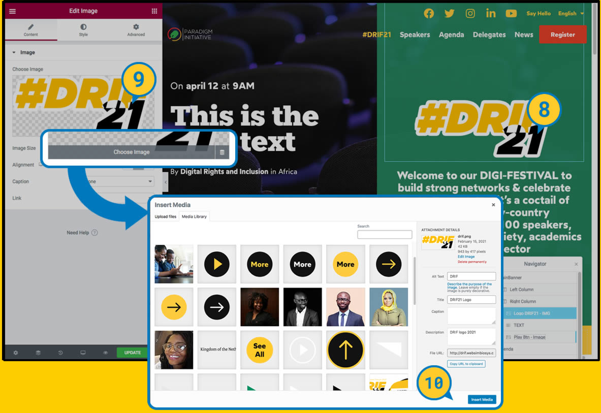
| The change of the image is similar. Locate and click on the component to be modified. In this case the left menu shows the option “EDIT IMAGE” where we can see the loaded image. |
| We place ourselves on the image, the option “CHOOSE IMAGE” appears and we click on it. |
Save changes:
 The media upload menu we saw earlier (View 02 Upload files) appears. We can choose a previously uploaded image, or upload it at this moment. Once uploaded or chosen, click on the “INSERT MEDIA” button. The media upload menu we saw earlier (View 02 Upload files) appears. We can choose a previously uploaded image, or upload it at this moment. Once uploaded or chosen, click on the “INSERT MEDIA” button. |
Links
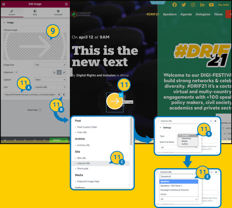
 To change the link of a button. We place ourselves on the element to be modified and click on the edit button in the upper corner. If we click directly on the element it is possible that the link or action of the button is activated. The administration menu shows us the options of the link that we can modify. If it is an internal page. We will have to copy the desired url previously and paste here (A) or if it is an internal page we can search it with the option “DYNAMIC TAGS” (B,C,D,E). If it is a link to an external site we must have previously copied the url to be modified (A). To change the link of a button. We place ourselves on the element to be modified and click on the edit button in the upper corner. If we click directly on the element it is possible that the link or action of the button is activated. The administration menu shows us the options of the link that we can modify. If it is an internal page. We will have to copy the desired url previously and paste here (A) or if it is an internal page we can search it with the option “DYNAMIC TAGS” (B,C,D,E). If it is a link to an external site we must have previously copied the url to be modified (A). |
Update Changes

 Before saving, check how it looks, because if we update directly, everyone will be able to publicly see the change we have made. Before saving, check how it looks, because if we update directly, everyone will be able to publicly see the change we have made. |
 If we are sure that everything is OK, we press the “UPDATE” button. From this moment on, everyone will be able to see the changes publicly. If we are sure that everything is OK, we press the “UPDATE” button. From this moment on, everyone will be able to see the changes publicly. |
 It is not recommended to change the visual editor options not specified in this manual, without advanced knowledge of design and layout (css), as each element is designed to fit in each site and modifying its values can cause the page to become visually out of place. It is not recommended to change the visual editor options not specified in this manual, without advanced knowledge of design and layout (css), as each element is designed to fit in each site and modifying its values can cause the page to become visually out of place. |
Elements Static content
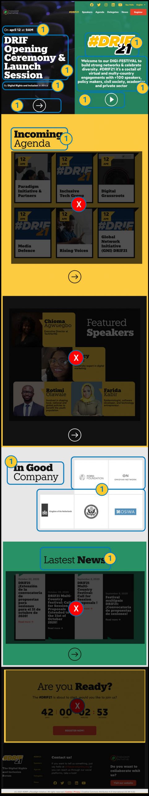
| The elements that can be modified on the front page are listed here. The rest of the elements are built as dynamic elements that will be modified in their corresponding section. (following chapters). |
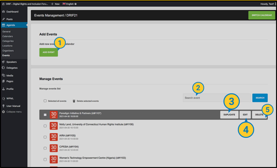
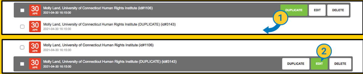
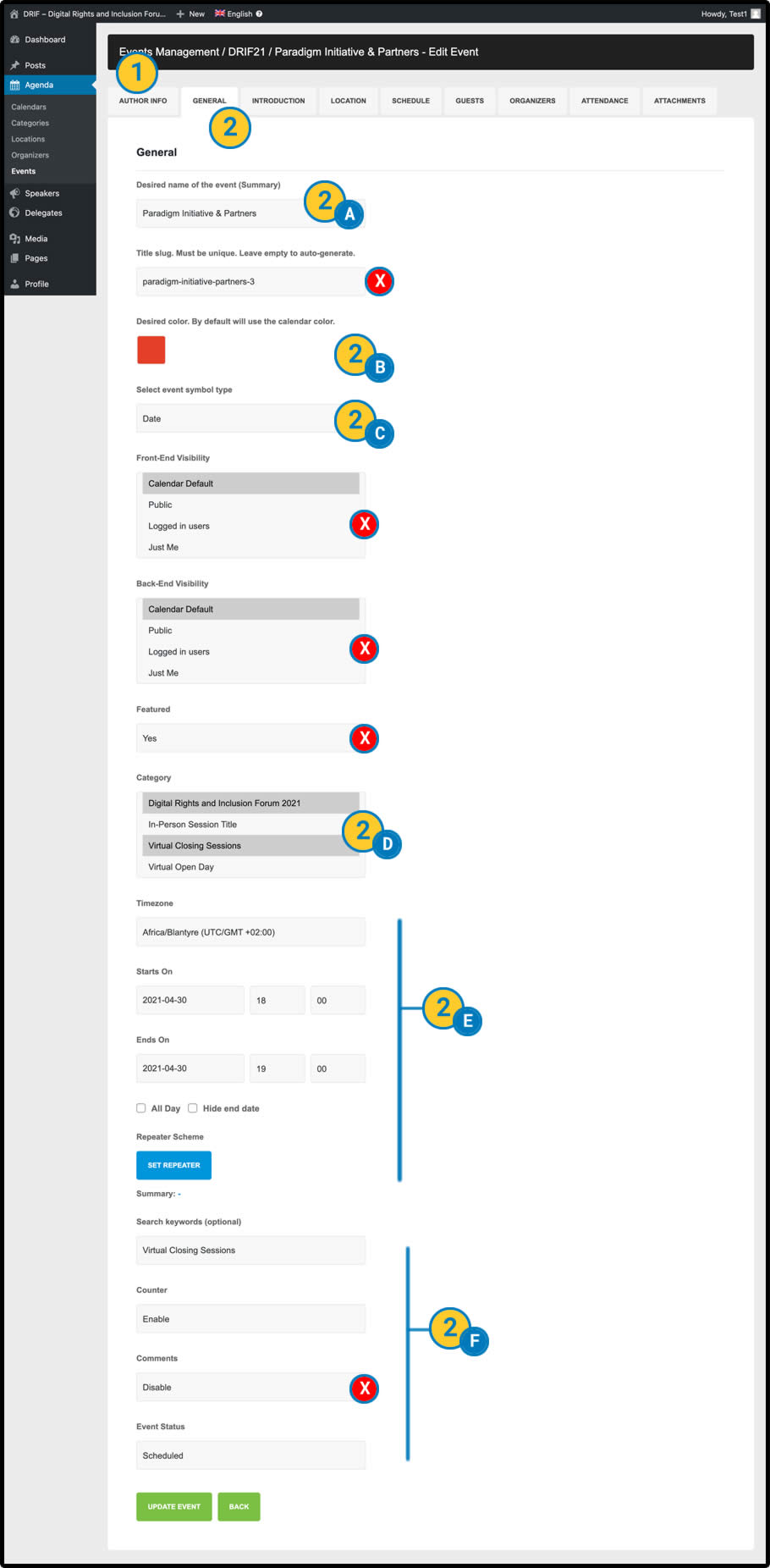
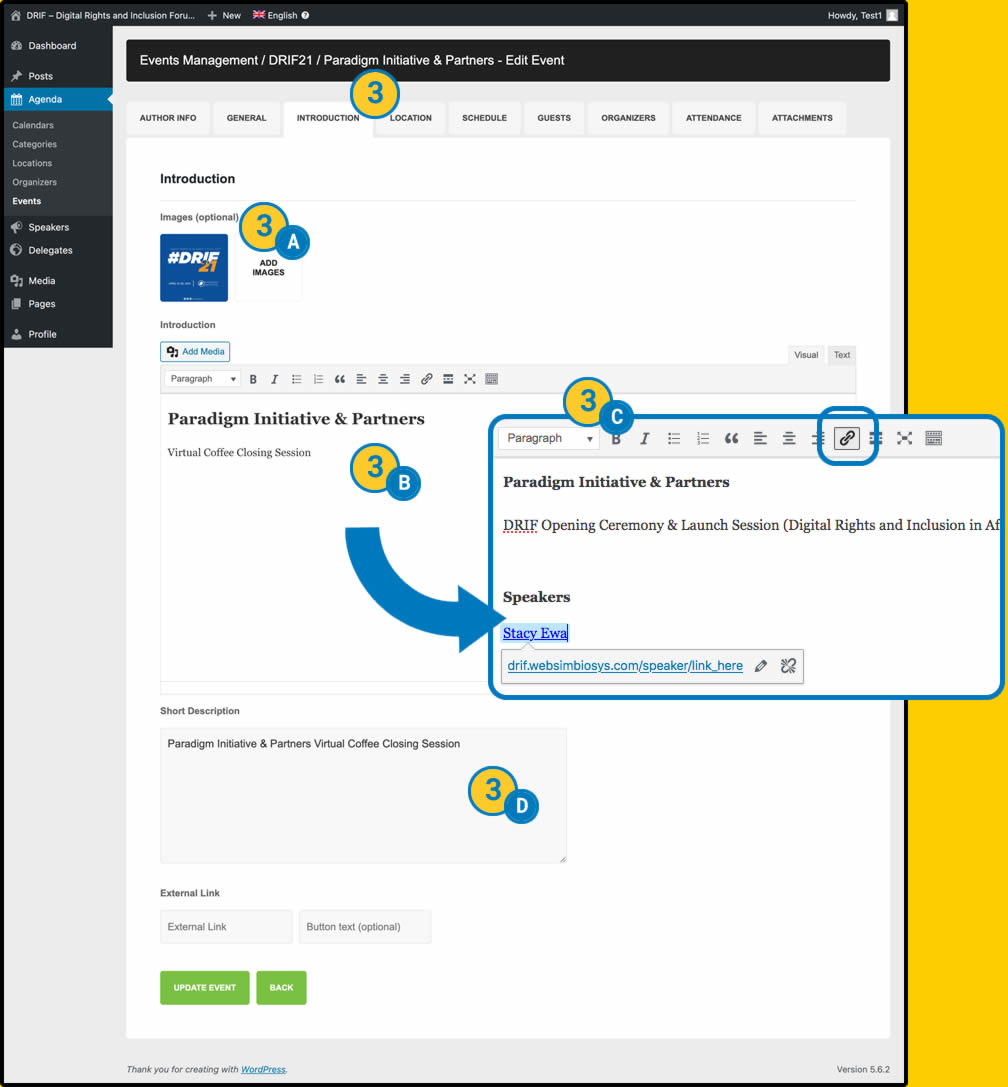
4 - Agenda
5 - Speakers
5. Speakers
The Speakers page is generated from dynamic content.

We can have up to four featured Speakers with a short biography and then we have the complete list of Speakers in the form of a grid.
It also appears as a widget on the front page of the website (the highlights section is displayed).
In addition, the details of each of the Speakers entered will also be generated automatically, as shown in the following image.
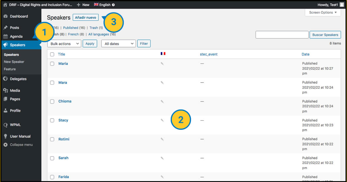
| “Speakers” section is located in the left side menu of backend. |
| The Speakers already created are listed here, and can also be modified from this screen. |
| New Speaker. This opens the screen for entering a new speaker. |
New/Modify Speaker
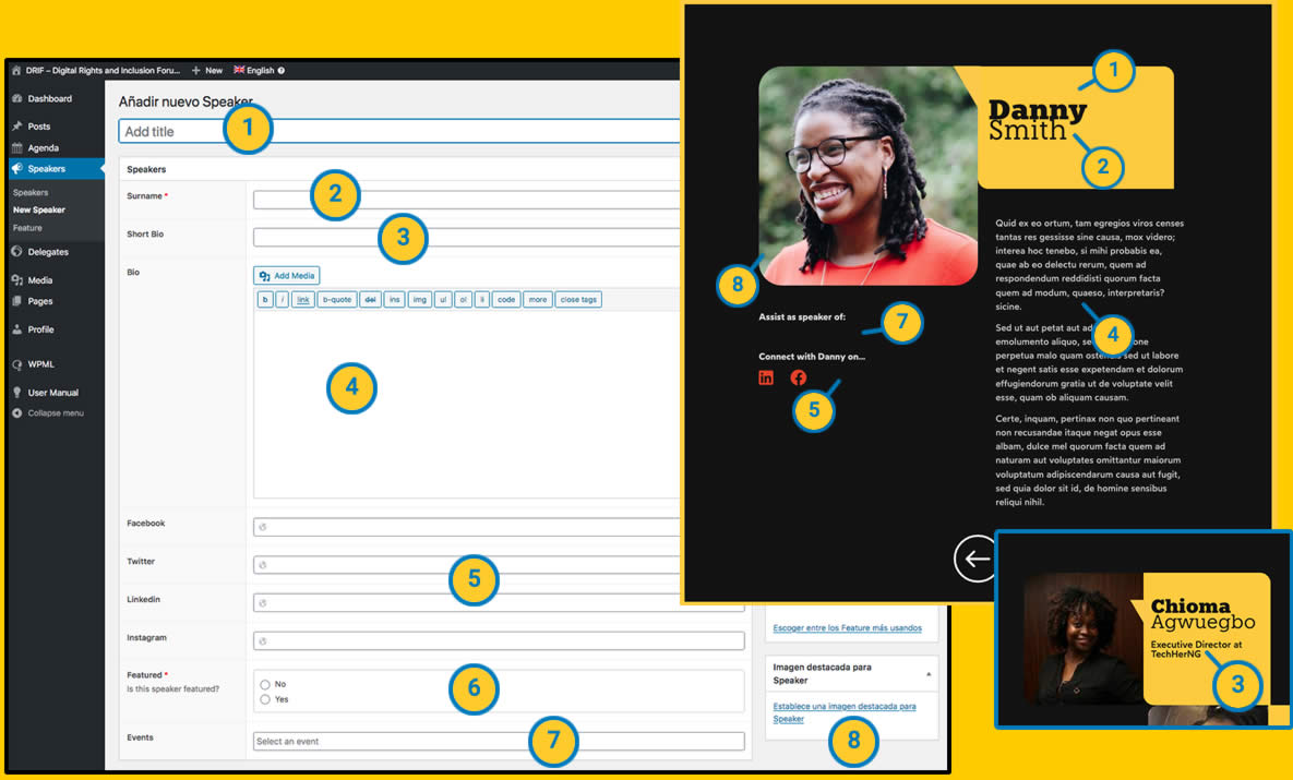
| Add title. Field to fill in with the name of the Speaker |
| Surname. Field to be filled in with the Speaker’s surname. |
Short Bio. Here we will write a short introduction that will be shown when the Speaker is among the four featured. (We recommend to put a very short introduction so as not to spoil the layout, there will be many place to expand the Bio in the next field). |
Bio. This is a field that allows us to write a complete biography, adding links, images, quotes…
This BIO will be displayed in the details of the speaker’s biography. |
| Social Links. We have 4 fields to link the Speaker’s social networks. The format must be a valid url, if we do not write anything, it will not be shown in its detail page. |
| Featured. In this field we choose whether we want the Speaker to appear among the four featured ones. (Remember that if you have selected more only four will appear) |
Events. This field is a selector of Events created in the Agenda.
You can filter by typing the name of the event or choose from the list, you can also choose several events for the same Speaker.
These selected events will also be displayed dynamically in the detail of the biography with a direct link to the detail of the event. |
| Image. Here we have an image field for attaching the picture of the Speaker that will be shown in the overview and in the detail view. |
6 - Delegates
6. Delegates
The Delegates page is generated from dynamic content. This is a visual filter in which we can choose one or more countries to filter the list of Delegates that appear.
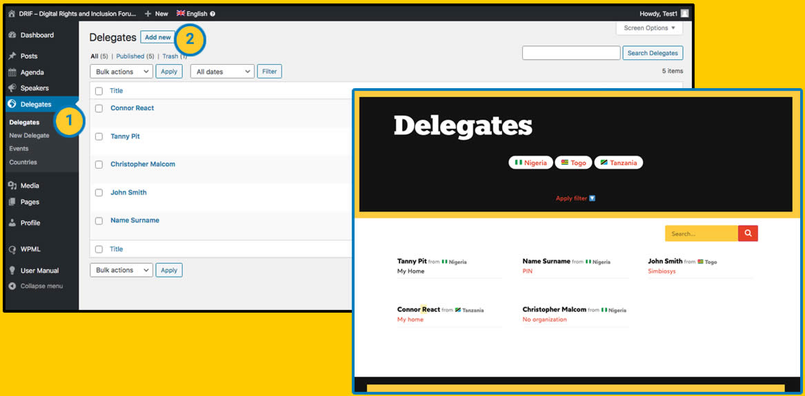
| From the Dashboard in the Delegates section, we can view and modify the Delegates already created or add new ones. |
| New Delegate. From here we add a new Delegate. |
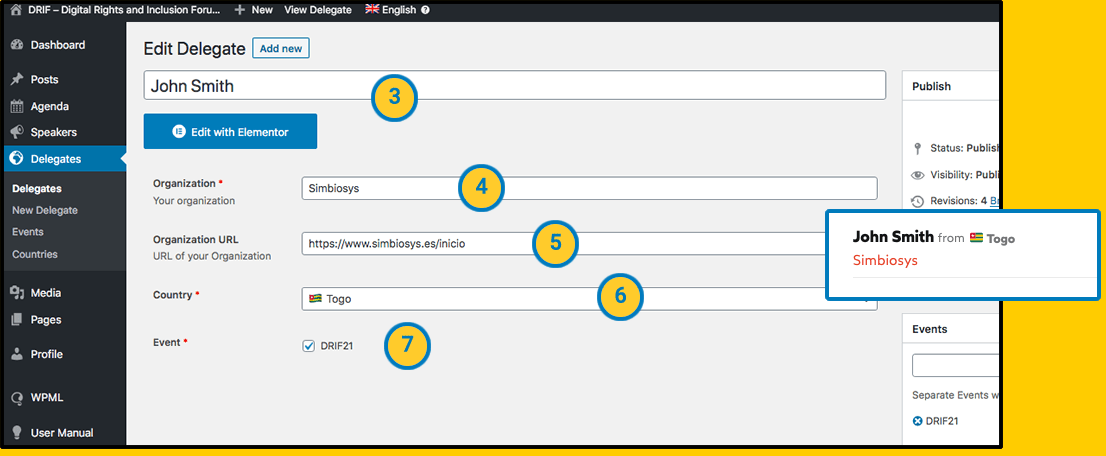
| Add title. Fill in this field with the Delegate’s name and surname. |
| Organisation. Here we write the name of the organisation. |
| Organization URL. This field is not mandatory, here we enter the link to the organisation’s website. |
| Country. This is a field for selecting the Delegate’s country of origin. |
| Event. In this field we choose the Event. (See how to create a new event) |
Events:
In the Events screen you can view the list of events, modify them and add new ones. “Add a new Event” button takes us to the event creation screen.
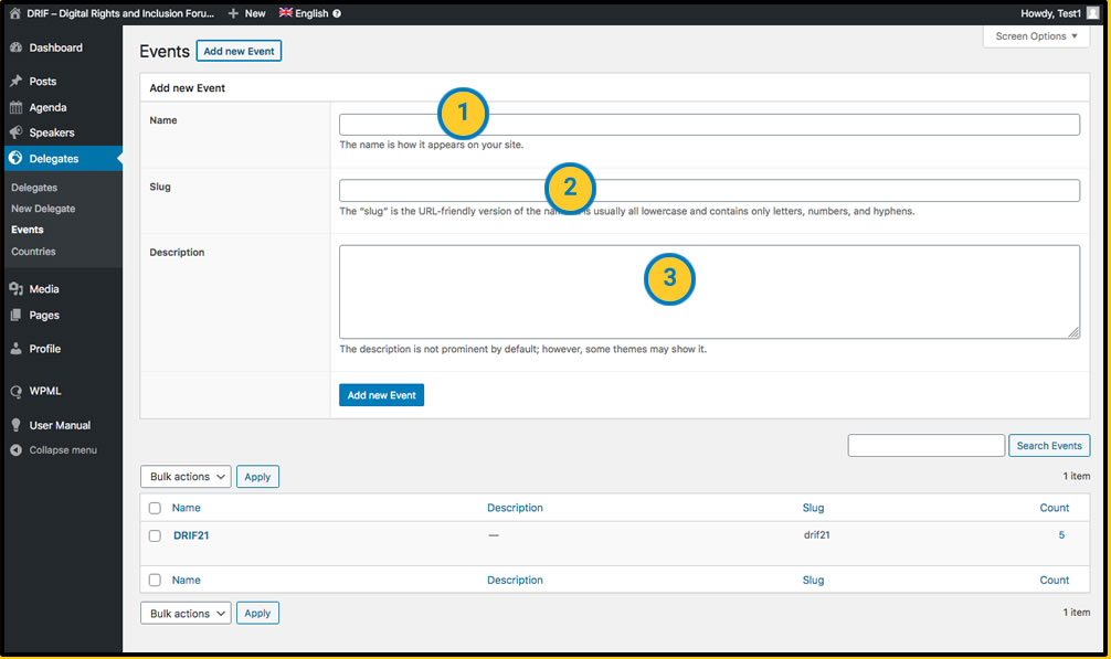
| Name. Here we write the event name. |
| Slug. The internal path to the event file. This path is automatically generated, it is not necessary to fill in this field manually. |
| Description. The description of the event. This element is not displayed anywhere on the website to visitors, but we can fill it in to have a description of the event at an administrative level. |
Countries:
In the Countries screen we can see the list of countries, modify them and add new ones.
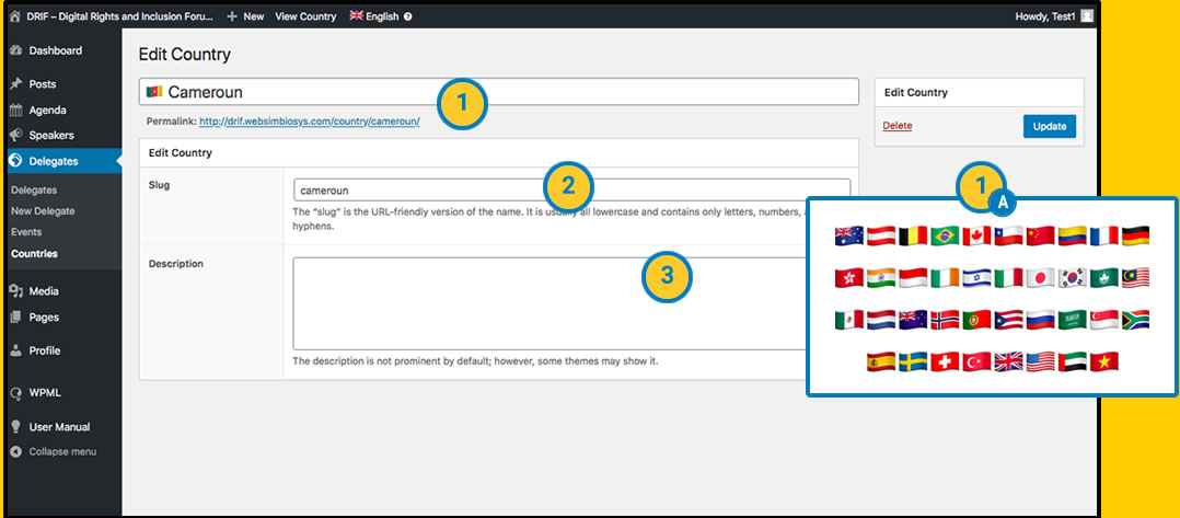
| Name. This is the country name field.
For purely aesthetic reasons, we can insert the flag of the country in Emoji format just in front of the name so that the flag appears in the section where the visitor selects the filter.
(A) Flags. To copy the emoji of a flag, we can go to a website
such as https://emojipedia.org/ and search for the flag (if we are on a
device that allows us to insert emojis directly, a smartphone for
example, this process would not be necessary). |
| Slug. The internal path to the country file. This path is automatically generated, there is no need to manually fill in this field. |
| Description. The description of the country. This element is not shown anywhere on the website to visitors, but we can fill it in to have a description at administrative level. |
7 - Static pages
7. Static pages
The web pages with static content are modified in the same way we saw for the “Homepage”. (View “3 – Home” section)

| With the visual editor of “elementor” activated, we click on any content that we want to modify. On the left menu it will show us your modification options. If no content is shown we can use the “Navigator” option (as we saw in point “3 – Home”) |
8 - Other web contents
8. Other web contents
Other elements such as the menu, the footer, wpml translations, templates … can only be modified by an administrator user. These options will be expanded in this manual once the basic contents are completed.
9 - Expand your knowledge
")